The Columbus Crew’s latest primary “The Home Kit” jersey has sparked quite the debate among fans. As the reigning champions, expectations were high for a jersey that would reflect their recent success (with the inclusion of the third star). Unfortunately, the design misses the mark.
A club and a city at the heart of American soccer
— The Crew (@ColumbusCrew) February 16, 2024
And we welcome everyone Home. pic.twitter.com/tmVONHiCDk
The Charlie Brown Connection
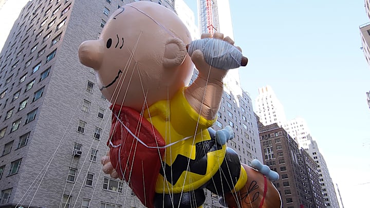
Upon first glance, it’s hard not to notice the striking resemblance between the jersey and something straight out of a Peanuts comic strip. The bold black stripes across the yellow background evoke memories of Charlie Brown’s iconic zigzag shirt. While nostalgia can be endearing, it’s an odd choice for a professional sports team.
A Missed Opportunity
After clinching the championship last season, the Crew had a golden opportunity to create a memorable jersey. Fans were hoping for a design that would celebrate their triumph and inspire pride. Instead, we got a jersey that feels more like a throwback to childhood cartoons than a symbol of soccer excellence.
Ready to Defend
Thankfully, jerseys don’t score goals or make crucial tackles. While “The Home Kit” may not win any fashion awards, it won’t impact the team’s performance on the field. The Crew’s players are professionals who know how to focus on the game, regardless of what they’re wearing. So, let’s put the fashion critique aside and focus on what truly matters: defending our title. Let’s embrace the quirky design, wear it with pride, and get ready to defend our title. After all, it’s not about the jersey; it’s about the defending our title.
